Simple Graphic Design
- CNH District
- Jul 12, 2024
- 4 min read
Updated: Jul 15, 2024

GOAL = THE GOSPEL
The goal of communication in ministry is to ultimately have the opportunity to share the gospel and see the Holy Spirit move in the hearts of people to come to faith in Jesus. Our CNH District churches and schools are constantly inviting the community towards that goal - planting seeds and inviting into a closer walk with Jesus (maybe even the first step).
In an age of information overload, it's easy to feel overwhelmed, as though our voice in the hectic lives of our people is drowned out by the loud messaging this world has to offer. Don't lose heart - we have the GOOD NEWS, the most powerful and life changing message one could ever hear. We've been commissioned by Jesus himself to boldly proclaim this GOSPEL message of great hope to all!
We reach out with BBQ events to build relationships, we invite our people to study God's Word, we design environments with fancy coffee for spiritual conversations, we serve and celebrate the sacraments, we proclaim Jesus through words and actions, we go out and selflessly serve our community as the hands and feet of Jesus. With the Word of God empowering His servants, we are constantly crafting the message, inviting and calling people to take action. Whether we are sitting down in front of blank screen with nothing but a blinking cursor to craft that perfect message or scrolling through a google image search as we put together images for a sermon powerpoint presentation - we are constantly designing an inspiring and compelling message for God's people to get up out of the pews (or interlocking padded chairs) and move!
1 PICTURE = 1000 WORDS
It's actually true, isn't it? The imagery in branding and graphic design has a powerful impact on the success of a message. There are no words attached to the following 8 logos and yet, I would be willing to bet you would score almost perfect in guessing the brands attached to the following icons. They might even evoke some emotions (or perhaps the realization that you are hungry)...

Everything we do, say, or design communicates a message - for better or for worse. With limited time and resources, as ministry leaders, we often overlook the importance of the visual communication. Here is your friendly reminder to not neglect the packaging of this message and invitation to hear and experience the gospel. Remember, that's the north star, that's the goal!
TEAMWORK = DREAMWORK
Don't try to go it alone. Discover the hidden skills within your congregation. Develop and invest in the youth and young adults who most likely have powerful photo, design, and video editing software in their pockets. Build out a timeline of the big events and programs on your calendar, and with your team, set some goals for this work.
PRINCIPLES
With a few simple concepts, we can improve our ability to package this invitation into one that people will see and hear. Taken from his framework for ministry communication, Brady Shearer of Pro Church Tools teaches the following three parts to designing any piece of communication (print or digital).

Print this photo, refer to it often. Rate and review your own efforts with this as your rubric. Maybe you're just pumping out un-inspiring information. Maybe your community wants to get involved or know more but they don't see a next step. Maybe you forgot to add the location or date/time.
With this framework in mind as a starting point, below are a handful of specific tips for designing ministry marketing.
AUDIENCE - Who is the intended audience? Are you using too much insider language? How well does it speak to who you are going after?
CLARITY & SIMPLICITY- We have a tenancy to want to say everything in every piece. Be clear with what you are saying and get right to the point.
CONSISTENCY - It's important for your organization to adopt a logo, common fonts, and colors. As this imagery is consistently displayed in your church and community it begins to have a positive impact when someone recognizes a t-shirt or a street banner or social media post. The following style guide is an example of how consistency is established and maintained.


VISUAL HIERARCHY - Rank your message by most to least important. Be sure your layout reflects that ranking.

FONTS MATTER: The fonts we use have a big impact in the design. They point towards a subconscious message and theme. Fonts can add or take away from what we are trying to say.

ALIGNMENT: Our eyes and brains do funny things when the visuals are not aligned. We see patterns and direction and movement. If we don't know what to look for next, we're confused and subconsciously we are thinking "sloppy".
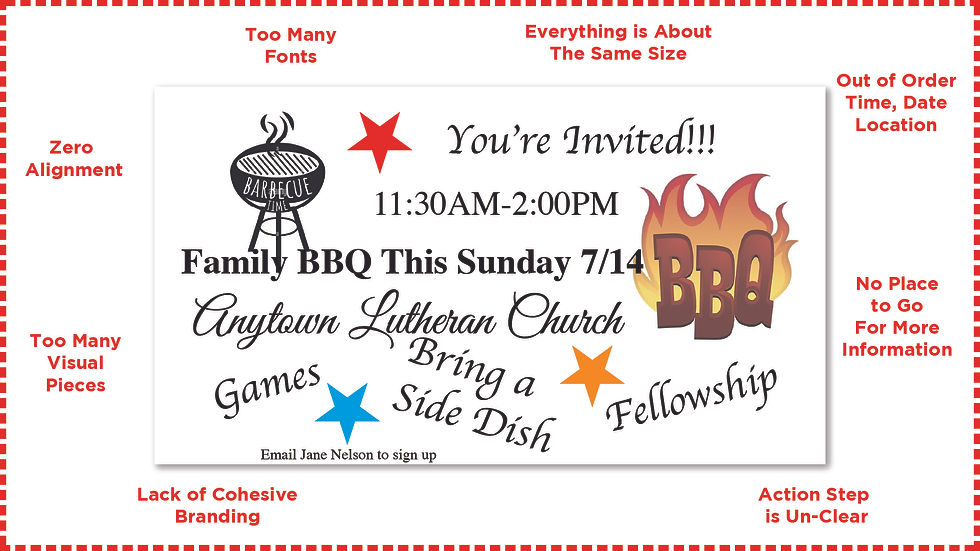
Below is a quick before and after example of a flyer designed for a make believe event at a pretend congregation. The surrounding explanation gives the method behind the madness utilizing many of the principles above.
BEFORE:

AFTER:

RESOURCES
The following resources have many great low cost, non-profit pricing or even free options. It goes without saying that the CNH District is not responsible for every piece of content in what are sometimes marketplaces. Use your discretion when utilizing and sharing these resources.
Design Software:
Powerpoint or Keynote
Image Resources:
Lutheran Communicators Facebook Group:
Did you know there is a group of communicators who share and inspire one another on Facebook?
Communications Audit:
A helpful starting point for talking with your congregation, volunteers, and staff is a quick communications survey. Get some feedback before you decide which channel needs the most work. You could also have a place for people to identify their age and life stage to get a better understanding of the specific audiences.


Comments